Talking about trends: Fall 2019

LogoWhile much of the world was experiencing extreme heat, it was a non-summer here in Alberta. Our big blue sky decided to take an extended vacation and left us with gloomy grey clouds and endless rain. Our furnace literally came on almost every morning! It’s hard to think about fall when you haven’t really had summer, but the fashions are out in the stores and it’s time to talk about trends.

Rich autumn colours are huge this season. Think pumpkin, caramel, cinnamon, gold, and spicy browns. Green, from light pistachio all the way to deep forest, is also very popular. Animal prints never go out of style, but they are bigger than ever this season. Leopard has been leading the way for the past few seasons, but now it’s being joined on centre stage by zebra and snakeskin. Plaids and checks continue to be popular as do floral prints.

Belts are showing up everywhere; wide ones, thin ones, and colourful ones, worn over blazers, sweaters, dresses, and coats. Perhaps an animal print belt is what’s needed to add a bit of flair to your fall wardrobe.

Shoulder pads, reminiscent of the 1970s, have made their way back into the fashion mainstream over the past few years and are definitely being seen again this fall. Though there’s no one skirt length for this season, maxi skirts have definitely made a comeback. Jumpsuits also continue to be on trend. Capes and long coats are very popular.

As always, some of the season’s trends may appeal to you and others probably won’t. Don’t feel compelled to wear something simply because it’s on trend. Instead, pick and choose those colours that suit your skin tone and looks that fit your personal style. And, before you go shopping for this season’s trends, remember to shop your own closet. Chances are, you’ll find something there that fits right in with the current trends.

Let me show you what I mean. Though I was tempted to dig into my fall/winter wardrobe more than once this non-summer, I haven’t actually done my seasonal closet switch yet and I had to go into storage to retrieve these items. None of them are new.

IMG_9828

I started with a pair of chocolate brown boot cut jeans, taupe booties, and a comfy brown sweater that has been around for a very long time. I haven’t worn it much in recent years and almost got rid of it several times, but now I’m glad I didn’t. This was a good beginning, but the outfit definitely needed some dressing up.

IMG_9833

I added a dark brown leather belt, a leopard print scarf, and a pair of gold tasseled earrings. That’s much better!

Now let’s go outside.

IMG_9868

For a chilly fall day, I’ve added the reversible wool cape that was my Mom’s. I don’t know for sure how old it is, but I think it was quite new when I wore it, ivory side out, over my wedding dress in October 1976! My daughter also wore it over hers 30 years later in December 2006! A gift from my husband last Christmas, the hat is by far the newest item that I’m wearing.

IMG_9864

Now, how many of this season’s trends did I hit without going shopping?

Wardrobe building with neutrals

LogoTo an interior designer, neutral means without colour and is used to refer to shades of beige, ivory, and taupe as well as black, white, and grey. In fashion, we expand this list to include all those great colours that don’t compete with anything else; colours that can be worn with pretty much anything in the closet. No wardrobe is complete without them.

Earth tones including shades of brown, tan, olive and khaki can be added to our list of fashion neutrals as can navy blue. If you’re not sure about navy being a neutral, just ask yourself where most of us would be without blue jeans. One of the reasons for their popularity is the fact that a dark jean goes with absolutely everything. Like the other neutrals, they make getting dressed easy.

Just because neutrals can go with any other colours doesn’t mean that every fashion neutral looks good on every woman. It’s important to identify which ones work best with your colouring. For most of my life I hesitated to wear black or white, especially close to my face, because they washed me out. Instead, I gravitated toward the warmer earth tones. As I’ve aged and my hair has greyed, I can get away with wearing black and white, but when I do I still need to add a bit of colour near my face or amp up my makeup a bit. A bright lip helps a lot.

Metals including gold, silver, pewter, copper, and bronze are also considered fashion neutrals. They most often appear as jewelry, but they can also work their way into our wardrobes as other accessories such as shoes and handbags, and sometimes even as clothing for special occasions or holiday dressing.

Patterns that are made up of neutral colours are also considered neutrals in the fashion world. Animal prints in black, white, grey, brown, gold, or tan are a good example of this, but stripes, plaids, and geometric patterns can also work as neutrals.

Neutrals can be worn year round, though the lighter shades tend to be more common in summer and the darker ones in winter. Off-white, tan, beige, brown, olive or moss green, and dark navy are particularly on trend this season, but you can never go completely wrong with any neutral. They have the advantage of being timeless colours. Because they go so well with everything, they’re also great wardrobe multipliers allowing you to create many different outfit combinations. This makes them especially valuable for building a small but versatile travel wardrobe.

A good wardrobe building tip is to choose two or three neutral colours that you like and that look good on you and begin by collecting fashion basics in these colours. Wearing only neutrals is very conservative, perhaps even boring, so you’ll probably want to add some brighter colours to wear with them. Unless you have an unlimited clothing budget, though, it’s a good idea to spend the bulk of it on neutrals.

Spring trends for 2018

LogoI’ve complained a lot lately about how long winter seems to be lasting here on the Canadian prairie, but the days are gradually warming up and some of you live where spring has already arrived, so let’s take a look at a few fashion trends for spring and summer 2018.

Fanny packs

That’s right! 1980s looks are back and with them come the fanny pack, or as it’s called in some places, the bum bag. The popularity of this simple zippered pouch worn around the waist like a belt was short-lived in the late 80s and who would have thought that it would make a reappearance thirty years later? It doesn’t do much for the silhouette, but when you think about it, the fanny pack is very functional. It allows for hands free shopping and is great for bikers, hikers and travellers. In our family, the fanny pack’s popularity in the 1980s was literally a life saver. Our oldest son was severely asthmatic and had to carry his inhalers with him everywhere he went. Now his asthmatic niece and nephew carry theirs in fanny packs just like he did. Fanny packs are available in a wide variety of colours and materials.

Head to toe denim

Dark wash denim seems to be making a resurgence this season and it’s being worn from head to toe. Ignore what I said in last week’s post about making sure the washes are different! This season denim is all about a monochromatic and slightly tailored look.

denim

photo

Sheer top layers

This trend allows us to show off as much or as little skin as we like depending on what we wear underneath. I can see a top like this one, worn over a simple camisole, looking good on a woman of any age.

b892b53dc92936fc87391aa7da7e4250_best

photo

As the weather gets hot, I’m afraid that this transparent look could be a style that goes very wrong! Hopefully modesty prevails and everyone remembers that some looks are meant only for the beach or the bedroom!

Fringe

Full-on fringe was a big look on the runways of New York, Paris and Milan, but there are simpler versions of the trend, like this poncho inspired blouse, that might appeal more to the majority of us.

photos

Adding a fringed or tasselled accessory, such as a handbag or even earrings, is also a good way to bring this trend into your wardrobe in a smaller way.

Pastels and paintbox colours

Soft pastels are a classic spring staple and they’re especially big this year. If you shy away from these “ice cream colours” try pairing them with your darker neutrals. Yes, you can wear black in the spring and summer, but add a pop of something pastel to lighten up the look.

Bright saturated colours are also on trend this season. Think Crayola crayons in primary colours or the paintbox that you probably had in grade school.

4cda5fb0-3810-4619-8977-db2a0c92798b

photo

If you invested in a trendy pink piece last year, you’re in luck. Pink is still on trend for spring and summer this year and it’s being seen in every shade imaginable from the palest blush to neon. Yellow is also popular, especially in dresses.

So now that I know what some of the latest trends are, it’s time to take a look at my spring and summer wardrobe and see what I already have that will work again this year. Believe it or not, I have a black leather fanny pack from the 80s hidden away somewhere! I also have a fringed top and some tasselled earrings as well as a summer tote with tassels. I have golf shirts in bold primary colours and here’s a very casual head to toe denim look. The photo was taken almost a year ago, but my dark wash jeans and waterfront shirt from cabi’s Fall 2016 collection will definitely work again this year!

IMG_4217 - Version 2


3Cs… classy, confident, and comfortable

LogoIn one of her most recent posts, Pam Lutrell of Over 50 Feeling 40, one of my favourite fashion blogs, presented her readers with a lengthy list of adjectives and asked us to choose the top three that we would like our wardrobes to say about us. I chose classyconfident, and comfortable.

In my mind, the first two go hand in hand. When I know I look good, I feel like I can conquer the world and to me looking good means dressing with class.

As I mentioned in last Friday’s post, now that I’m retired, I want my wardrobe to be what I would call classy casual.

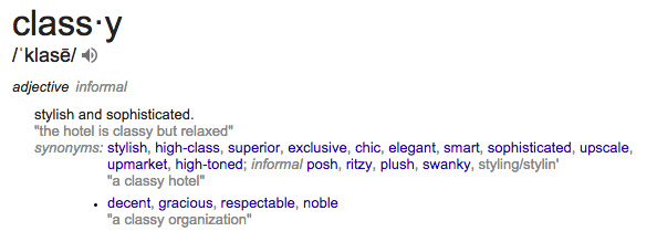
Screen Shot 2018-01-24 at 3.45.05 PM

So what makes an outfit classy? There are no one size fits all rules, but here are a few tips to help:

Learn how to dress your body type  –  What looks good on some of my curvy girlfriends might do nothing at all for my boyish figure and vice versa. Look for garments that highlight your best features and don’t draw attention to the ones that you’d rather conceal.

Fit  –  In the words of Stacy London and Clinton Kelly of What Not to Wear fame, “If you don’t have fit, you don’t have style.” The key is to try things on and look in the fitting-room mirror with a critical eye. Do shoulder seams lie in the right place? Are armholes sufficiently high without cutting into your armpits? Does the garment pull across your shoulder blades? Is the length appropriate? Is there puckering or wrinkling anywhere? If you’re unsure about fit, try on another size for comparison. Then, if you’re seriously considering buying an item, leave the dressing room and head for the three-way mirror! Don’t buy anything without first checking the fit from behind!

Know which colours look best with your complexion  –  Wearing the right colours can make your hair look radiant, your eyes pop, and your skin glow. On the other hand, the wrong colours, especially worn close to your face, will make you look tired or washed out.

Modesty  –  I’m not talking about hiding under a nun’s habit or a burqa here, but there’s nothing classy about overexposure! Unless you’re at the beach or beside the pool, keep your cleavage and your belly button covered. Underwear is meant to be worn under what you’re wearing, so keep your bra straps out of sight too and please, please remember that leggings are not pants! Make sure your butt and your crotch are covered. ‘Nuff said!

Accessorize, but don’t overdo it  –  Jewelry is meant to enhance an outfit, not overpower it. In my opinion, understated is better than garish or overly ostentatious. Scarves are a great way to add colour and visual interest to an outfit and don’t forget that your shoes are also an accessory. There’s nothing like a cute shoe to add a little class!

When it comes to classy, confident dressing, learn to trust your instincts. Wear what makes you feel like your best self. Think about the outfits that you feel happiest wearing and the ones that you receive the most compliments on. Chances are, they make you look classy. And don’t forget that dressing classy doesn’t have to cost a lot. Yes, you could spend hundreds or even thousands of dollars on designer clothes, but you can also find comparable looks at reasonable prices, and if you’re like me, you might even find some wonderful buys in your local thrift stores! Check here for 18 tips to help you!

Comfortable is my final C word and to me, that’s a no brainer! Regardless of how well a garment fits and whether or not the colour suits you, if you don’t find it comfortable or you don’t like the texture of the fabric, you won’t enjoy wearing it.

What words would you choose to describe what you would like your wardrobe to say about you?


Silver and gold!

LogoWhen I was young I wore only gold jewelry. I instinctively knew that it looked better on me than silver did. Sure enough, when I had my colours done in the 1980s, the analyst draped me in a gold metallic cloth and I glowed. Not so with silver. My skin had warm undertones and I was a Spring.

With the passage of time, however, I began to notice a change. As silver streaks began to appear in my hair, I realized that I could wear colours that I hadn’t been able to before, particularly black and white. I also began to add silver jewelry to my collection.

I particularly like pieces that combine both metals. I have several pairs of earrings and a favourite necklace that are part gold and part silver. I’ve always been especially thankful that the watch I received as a retirement gift from my employer is also both gold and silver as I wear it almost all the time.

IMG_5405

Until this Christmas, I wore three rings that I never take off (except when I’m undergoing medical scans that require me to remove all metal).  My engagement ring, my wedding ring, and my family ring are all gold. I’ve always thought that adding a silver ring would look odd, but my Christmas gift from my husband solved that problem! It’s both silver and gold!


IMG_5415

There’s a long story behind this beautiful and very unique ring. Last summer, we were wandering the shops in Jasper, Alberta with our oldest son and his family when I spotted a ring very similar to this one in Our Native Land, a gallery featuring authentic arts and crafts by Canada’s aboriginal artists. I fell in love with the concept; a wide band of sterling silver overlaid with a narrower band of 14kt yellow gold hand carved with a Northwest Coast motif. If you read my post about The Hazeltons last summer, you might remember how much I love the art and culture of the native peoples of the Pacific Northwest.

When our summer vacation was over, I couldn’t get that ring out of my mind. I began to do some research which soon led me to the website for Vancouver’s Douglas Reynolds Gallery. There I found a wide selection of wonderful rings including a couple of the style I had in mind. The website also referred to a book entitled Understanding Northwest Coast Art by Cheryl Shearar which is a detailed guide to the crests, beings and symbols used in Northwest Coast art. I had my local library bring it in and read it from cover to cover to help me decide what motif I wanted on my ring.

A Hummingbird Ring by Haisla artist, Hollie Bear Bartlett, was one of the ones that had caught my eye on the gallery website. The Haisla Nation are a subgroup of the Kwaguilth people, the group that I had focused on during my first anthropology course many years ago at the University of Calgary. According to Shearar’s book, the hummingbird isn’t traditionally a major motif in their art, but “it’s popularity today indicates that it has become a very important symbol of love and beauty.” Perfect!

I told Richard that this was what I wanted for Christmas, but the ring that was advertised wasn’t my size. He contacted the gallery to find out if it was available in other sizes and was told that they could have the artist make one in my size in time for Christmas. Even better! A ring made especially for me by the artist! Richard arranged to pick it up at the gallery on Dec. 23, the day after we planned to arrive in Vancouver for Christmas. By the time we arrived at the gallery, I was as excited as a little child waiting for Santa! After I tried it on, however, it went back in the box to be wrapped and placed under the tree at our son’s house until Christmas morn.

IMG_5410

The ring wasn’t the only piece of jewelry that I received for Christmas. Santa left this silver bangle in my stocking. I think he probably had some help from my daughter-in-law though! After all, she’s the wise young mom who tied a “courage bracelet” around her timid young son’s wrist to remind him that he could be brave and face whatever challenges come his way. My bracelet says “She believed she could, so she did” and I love it!

Please note: The individual ring photos are from the Douglas Reynolds Gallery website. The other photos are my own.


How to mix patterns like a pro

Logo

IMG_5247

When I used this photo in a previous post, one of my friends commented on the nice mix of patterns, so today, let’s take a look at why it worked. I most often wear a pattern with a solid colour, but in this case I employed a few methods that enabled me to mix patterns and yet maintain a cohesive look.

First, the three patterns that I’m wearing here are all made up of the same colours… black, white, and grey. Keeping the fabrics within one colour family is a simple way to keep from looking like you got dressed in the dark!

I’ve also varied the size of the prints, choosing the large plaid of my sweater to dominate and two smaller patterns to compliment it.

Some patterns mix much more easily than others. In the world of mixing and matching, stripes and leopard prints are considered neutrals because they will go with almost anything. Black and white stripes are especially easy to work with. Grid patterns and polka dots also mix well with almost any other pattern.

IMG_5358

I don’t ever remember wearing polka dots before, but I picked up this eternity scarf at our local thrift store recently (where I also bought the sweater shown above) and I love it! Here I’m wearing it with the same black and white striped t-shirt that I wore in the first photo.

Some fashionistas like to mix bolder and more colourful patterns, but I prefer a more classic look, so this might be about as far as I’ll ever go when it comes to mixing patterns. What about you? Do you like to mix patterns? What tricks do you use when putting them together?

And a special note to Jan… thanks for inspiring this post! I always love to hear from my readers.


The colours of cancer

BreastCancerAwarenessPinkRibbonOctober is Breast Cancer Awareness Month and the world around us is turning pink. Professional football players wear pink booties and gloves, NASCAR drivers dress in pink and drive pink cars, and restaurants serve up pink drinks and even pink burgers! In October anything pink sells; everything from pink vacuum cleaners to pink tools and coveralls. Don’t get me wrong; I have nothing against increasing awareness of the disease that is one of the leading causes of death for Canadian women. It took the life of one of my dearest friends just over nine years ago, but I’m fully behind the “Think before you pink” movement that strives to draw attention to the fact that all is not what it appears to be in the world of pink.

Samantha King is the author of Pink Ribbons, Inc., a 2006 book that examined how breast cancer has become a dream come true for some companies that want to bask in the glow of corporate do-gooding. An associate professor of kinesiology and health studies at Queen’s University in Kingston, King helped popularize the term “pinkwashing” to describe campaigns that flaunt the ubiquitous pink ribbon but have negligible effects on the realities of breast cancer. Some companies use pink ribbon related marketing to increase sales while contributing only a tiny fraction of the proceeds to the cause, or use pinkwashing to improve their public image while manufacturing products that may, in fact, be carcinogenic.

Any company can put pink ribbons on its products. When purchasing cancer awareness products, be a savvy shopper. Check the label or tag and ensure that a percentage of the purchase price is actually going to a recognizable foundation or non-profit organization. Oftentimes, making a direct donation to your favourite cancer charity is actually a better way to go.

Is pink the only colour of cancer though? Absolutely not! In fact, there are awareness ribbons in practically every colour imaginable, each one representing a different cancer. Ovarian cancer is teal, uterine cancer peach, liver cancer emerald green and colon cancer dark blue. Prostate cancer is light blue, testicular cancer orchid, leukemia orange and mesothelioma royal blue.

And what of my cancers? Head and neck cancers are burgundy and white, but that one is gone, hopefully for good. This is the ribbon that I wear:

zebra ribbon

The zebra stripe represents neuroendocrine (NETS) and carcinoid cancers. It’s not surprising that we zebras don’t get as much attention as those pink people do. After all, there aren’t very many of us. In Canada, specific numbers for neuroendocrine cancer are not even reported separately, but in the US there are an estimated 8000 new cases each year. Compared to the approximately 294 500 new cases of breast cancer that are expected to be diagnosed in that country in 2015, that’s a very tiny number, but we need awareness too. There are family doctors who have never heard of neuroendocrine cancer. They have no idea what it is, how it’s treated or that it’s incurable. A locum filling in at our local hospital actually questioned whether I had cancer at all!

NETS not pink

Blogs devoted to NET cancer awareness:

https://ronnyallan.wordpress.com

http://walkingwithjane.org