Making trends work for you

Logo

getty images

Photo – Getty Images

Chances are, you aren’t going anywhere dressed like this this fall. Neither am I, but this intriguing outfit incorporates, to some extent, at least nine of this season’s biggest fashion trends! Let’s take a look at what they are:

  1. Red
  2. Plaid
  3. Oversized tote bag
  4. Oversized blanket coat
  5. Large, colourful floral print
  6. Flowing maxi dress
  7. Animal print
  8. Extreme layering
  9. Slouchy boots

Screen Shot 2018-09-03 at 7.51.11 PM
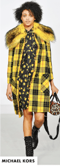
Plaid is really a returning trend from last fall and winter, but this year’s reinvention includes plaids in wild colours, head to toe plaid, and mixing plaids. Similarly, while animal prints are an enduring trend and are usually considered a neutral, this season you can also expect to see neon zebra and garishly coloured leopard prints. If you want either a plaid or an animal print to have enduring value though, opt for a more traditional look that you’ll be able to wear for years.

For those of us who live a cold climate, layering is a no-brainer during fall and winter, but this year’s trend takes it to the extreme with multiple layers often topped with a bulky oversized coat. One of the great things about this trend is that it allows you to continue wearing some of your spring and summer pieces right into fall and winter. For example, think about layering a sleeveless summer dress over a long sleeved shirt or tee and leggings, then don’t be afraid to pile on a few more layers!

Have fun with the trends, but don’t become a slave to them!  As always, the key to incorporating the latest fashion trends into your wardrobe is to consider how you might put your own interpretation on them while staying true to your own style. Begin by shopping your closet to see how you can make the trends work with what’s already there. For example, I’ll definitely be wearing the black and white plaid shirt that I bought second hand in the spring of 2017 as well as the Check Shirt from Cabi’s Fall 2017 collection again this year. I also have a couple of leopard print items in traditional neutral colours that will be in circulation again this season. I’ve been doing a major closet cull lately and I almost let go of an older leopard print shirt that I haven’t worn for a long time, but I changed my mind and snatched it back out of the bag that’s destined for the thrift store! I’ll show it to you next week.

Preparing for seasonal transition with a new neutral

LogoIf you’re like me, you probably find it easy to reach into your closet and pull out the same combinations over and over again, but once in awhile I like to put things together in new and different ways. That’s what I’ve done today.


IMG_6130

I’m not quite ready to put away my summer wardrobe and bring out my fall and winter wear, but the days are definitely getting cooler. Now’s the time for transitional pieces. Instead of capris and shorts, I’m back in jeans most days. These ones are the Brick Dust Skinny from cabi’s Spring 2018 collection. I’ve been trying to add more colour to my wardrobe and these have definitely done that. The wonderful thing about this pinkish orange colour is that it actually works like a neutral pairing well with lots of other colours and looking good on everyone. I look forward to building lots of different outfits with these pants as my base.

Today I’m wearing the Brick Dust Skinny with a basic black t-shirt from Uniqlo and an old, very well-loved cotton shirt that I bought in Japan many years ago. The colour has faded a little over time, but I love the soft muted olive. Another neutral, olive is particularly flattering to those with warm undertones and it also teams well with many other colours.

Accessories always finish an outfit and I love the way the colours in my bracelet pull this look together. I’m wearing white sneakers for a casual vibe, but I could easily dress the outfit up a bit with a different pair of shoes.

Unfortunately, cabi’s Brick Dust Skinny is no longer available, but this season’s High Skinny in a lovely grey called Smoked Pearl is essentially the same pant. I may have to add it to my closet! If you’re dying for a pair in the Brick Dust colour, Uniqlo has something similar here.  They call the colour Brown, but it looks pretty close to me.

Combining colours

LogoWhen I was young you didn’t wear blue with green or brown with black and you most certainly didn’t pair red with pink. Thankfully, times have changed and most of the old fashion rules have been thrown out the window!

I never did understand the problem with blue and green. After all, we see that combination in nature all the time. The sky is blue and the trees are green and we don’t find that aesthetically unpleasing. When it comes to fashion, I’m particularly fond of navy and emerald green together. Here are a couple of combinations that I found on Pinterest.

Brown used to be a staple in my wardrobe and life definitely got easier when combining it with black became acceptable, but what about red with pink? Apparently that’s a trend that’s continuing into fall, but I’m having trouble getting my head around it. The outfits shown on the runways are always a bit outlandish, but even if the clothing was more my style, I’m not sure I could see myself in this colour combination.

What about you? Do you wear pink and red? Would you? What are your favourite colour combinations?

Building confidence from the outside in

LogoWhile it’s true that what we wear only enhances the beauty that comes from within, for most of us there is a direct correlation between how we look and how we feel about ourselves.

In a recent post, Sue Burpee who writes High Heels in the Wilderness, said that fashion blogging has given her greater self-confidence. Once very self-conscious about having her picture taken because she considered herself unphotogenic, blogging has given Sue a reason to accumulate and curate a collection of photos of herself that she’s very pleased with. Like anyone else, she can still have a confidence shattering moment when she walks by a mirror-like panel of tinted windows and catches her own reflection, but she has learned that it’s possible to build confidence from the outside in.

I have found the same thing. Sometimes posting multiple photos of myself and writing about what I wear can seem a bit narcissistic, but taking a greater interest in fashion and in my own appearance has definitely been a confidence booster.

Understanding how wearing the right clothing and accessories can contribute to our confidence, raise our self-esteem, and help us find greater success in the workplace has become big business. Image consultants and personal stylists assist everyone from celebrities to ordinary mortals rethink their wardrobes and make choices that enhance their appearance and boost their confidence.

Dressing for confidence doesn’t require wearing the latest fashion trends or spending a fortune on your wardrobe. Far from it. It’s simply a matter of knowing what looks best on you and what makes you feel good about yourself. Here are several things to keep in mind.

Learn to dress your body. What looks good on your friend may not suit you and vice versa. Though there are many different ways to describe body type, you can find a simple calculator here to help you determine which one of these 4 basic types best describes you. A quick search of “how to dress ____ body type” will lead you to many helpful tips and suggestions.

Screen Shot 2018-05-27 at 7.38.12 PM

I’m a banana! What are you?

Know which colours flatter you. Colours that suit your skin tone have the power to take your look from blah to radiant.

Consider the occasion. Whether you’re going to a business meeting, lunch with a friend, shopping, church or a gala event, what you wear should be tailored to the occasion. Your goal shouldn’t necessarily be to blend in, but you will feel much more confident if your outfit suits the occasion.

Consider your comfort zone. While I urge women to step outside their fashion comfort zone and try new looks, change can be intimidating. A complete makeover might be a confidence booster for some, but others of us need to take baby steps. Small changes can make a big difference.

Embrace your favourite features and downplay the ones you don’t want people to notice. You can find some good tips on how to flaunt your favourite features here.

Finally, think about a time when you felt great in what you wore. Think about the times when people complimented you on what you were wearing or how you looked. Chances are those occasions built your confidence from the outside in. What was it about those outfits that drew positive attention from others or made you feel so good? Was it a flattering neckline, the length of your skirt, the fabric, the colour, or maybe the shoes you wore? Perhaps you can implement something of those looks into what you wear for other occasions.

How-Style-Affects-Self-Confidence-Quote

The always stylish denim jacket

LogoIn the world of fashion there are trends like the bell sleeves that I wrote about last week, that are often short-lived, and then there are timeless fashions that never go out of style. I’ve been thinking a lot about one of those lately. Perhaps it’s the fact that winter seems to be going on forever this year, but I’m getting very tired of my winter wardrobe and I’ve been dreaming of the day when I can begin wearing my denim jackets again.

The jean jacket is a classic fashion staple that’s comfortable, casual, and easy to wear. Created in the United States in about 1880 by Levi Strauss, it was originally designed as a durable, heavy-duty jacket to be worn by cowboys, miners, and railroad workers. Over time, however, it has become a wardrobe staple for men and women alike.

I don’t suppose any woman really needs three blue jean jackets, but all of mine are thrifted (I spent a total of less than $10 on them) and each one is different. For the purpose of these photos, I’m wearing each of them with my grey striped Breton tee and dark wash jeans. Yes, you can wear denim-on-denim! Just make sure the washes are different.

My favourite is a traditional jean jacket from Gap.

The second one, from Jones New York, is made of very lightweight denim. It has snaps instead of buttons and the pockets give it a slightly dressier look. It also has a bit of elastic at the sides for a closer fit.

The third, from Fylo, is a fitted blazer style. Its brass buttons set it apart from the others, but the faded denim keeps it looking casual.

Not all denim jackets are blue, of course. Here’s one that comes in a wide variety of colours and it’s on sale right now. I love the Monticello Peach! This cute one in a floral print is also on sale.

My black denim jacket (also thrifted) from Bianca Nygard has appeared on the blog a couple of times in the past. With its silver sparkle and big blingy buttons it is super easy to dress up, but it can still be worn casually as shown here.

What’s not to love about a denim jacket? It’s stylish and amazingly versatile. You can wear it with almost anything, so don’t save yours only for casual wear. Here, the second jacket shown above adds an effortless, casual vibe to a much dressier outfit. I’m wearing it with the Treasure Dress from cabi’s Fall 2017 collection. I seldom wear heels, but I thought these ones, passed down to me by my very generous sister-in-law, added to the dressy summer look that I was going for here.

IMG_5538

Now, if spring would only get here!

I’d like your help

LogoEarlier this month, I had the opportunity to shop my sister-in-law’s closet again. Though I’m a little taller, Sue and I are very similar in size and can usually wear one another’s clothes without alteration. Before we arrived for our annual February visit, she had done another major closet clean out and had several large bags of clothing waiting for me to go through.

Today I want your opinion on 4 tops that now hang in my closet. Please be honest about whether or not you think I should keep them and tell me why.

#1


I actually like everything about this one from Cleo, one of my favourite Canadian fashion retailers. It fits perfectly and the soft polyester knit with a hint of spandex is oh so comfortable. Teal is one of the colours that suits every skin tone and the pattern doesn’t overwhelm me. The shirttail hem with ties at the sides takes it one notch up from a simple t-shirt.

#2

IMG_5479

Sue tends to wear dramatic colours and patterns while I favour neutrals. This one, also from Cleo, combines the two. Though fuchsia is also a colour that most women can wear, I like having the beige and grey tones closer to my face. I love three quarter length sleeves and this top is long enough that I can wear it over leggings. Though I love the look of the wide trim on the sleeves and the bottom edge, it does tend to catch on things.

#3

IMG_5483

I love the length and the fit of this button down tunic from Northern Reflections, another Canadian retailer. The lightweight polyester drapes beautifully, but I wonder if the pattern is a bit too intense for me. Perhaps it looks better under my denim waterfront shirt from cabi. What do you think?

IMG_5489

#4

IMG_5495

This silky blouson style top, also from Cleo, is actually a petite. It’s shorter than I usually wear, but other than that it fits well and the sleeves are long enough. It’s very lightweight and would make a good transition piece for spring (if it ever gets here!), but again, I wonder if it looks better under a sweater like my shirttail cardigan from cabi.

IMG_5499

Now that I’ve shopped Sue’s closet, please help me curate mine. Let me know your thoughts about these 4 tops in the comment section below.


A pop of colour

LogoMy wardrobe is quite monochromatic… a lot of black, white, and grey; much like our Alberta winters. One of my goals this year has been to add some colour, so when I saw these bright red jeans at our local thrift store, I had to try them on. After all, red is one of this season’s hottest trends. They fit perfectly and are oh so comfortable!

IMG_5332

These are Aiko Skinnies from the Silver Jean Co. They don’t appear to be available in red any longer, but they can be purchased in the more traditional medium and dark washes and there are also similar styles available in black, white, or grey.

Though not brand new, they show no sign of fading and the only bit of wear was a tiny section of one of the inseams that needed to be restitched. It only took a few minutes to mend and is completely unnoticeable.

These jeans definitely add a pop of colour to a drab winter day!


What do you think? Would you wear bright red jeans?

Luscious lips

maxresdefault

LogoDid you know that lip colour fades with age? I didn’t either.

I was in my teens when I first tried wearing lipstick and I hated it. It felt waxy and it dried out my lips. That was when I decided that I really didn’t need it anyway as I was blessed with plenty of natural pigment in my lips. A bit of gloss was all that was needed to dress them up.

Not so anymore. I’ve started to notice that without lipstick, I often look a bit washed out. At first, I attributed it to the fact that my wardrobe is largely neutral in colour, but then I learned that as we mature, we experience natural loss of lip pigment. We also lose lip volume with age which accentuates the loss of colour.

So, lipstick it is, but how to choose from the myriad of options that are available?

Lipstick composition hasn’t changed much over the years, but I find that the moisturizing formula of Revlon Super Lustrous Lipstick works well for me so I’m sticking to that brand. If you have trouble with lipstick drying out your lips, I’d recommend giving it a try.

c700x420

Once you find a brand that you’re comfortable with, there’s still the question of colour. So many choices! Here are a few tips that might help.

Choose colours that enhance your skin tone. If your skin has warm undertones, experiment with shades of coral, peach, copper, or bronze. If your skin has cool undertones, try mauve, mocha, cranberry, or wine colours.

Every woman can wear red, but we shouldn’t all wear the same red. As with clothing, especially anything worn close to your face, skin with warm undertones looks best with an orange-based red while skin with cool undertones looks better with a blue-based shade.

Unless you shop at a high end cosmetic counter that provides alcohol to clean the tester as well as sterile brushes or cotton swabs to apply the sample colours, you won’t want to apply the tester lipstick to your mouth. Rather than testing the lipstick on your wrist or the side of your hand, test it on the pads of your fingertips which are much closer to your lip colour.

For a subtle everyday look, choose a colour that’s just a bit darker or brighter than your natural lip colour. For dressier occasions, go for dramatic lips or eyes, but not both.

Don’t try to match your lip colour too closely to your clothing. For example, if you’re wearing a bright red dress, a lipstick in the same colour will be overwhelming. Perhaps try a darker shade.

Don’t forget that you can create your own lipstick colours by blending more than one. If one of my darker colours seems a bit too bold, I simply add a light coat of my more subtle everyday colour to tone it down a bit.

Most important of all, remember that these are just guidelines. Rules are meant to be broken. First and foremost, wear what makes you feel confident and happy and don’t forget, once you’ve coloured those lips, add a smile!

Please note: This is not a sponsored post.

Another photo challenge

I get very irritated by a lot of stuff that floats around the internet and lands on my Facebook page, especially the “pass it on” posts that are simply a newer version of the age old chain letter. Once in awhile, however, something more interesting comes along.

A couple of years ago, a friend and former student nominated me to take part in a Facebook nature photo challenge which I enjoyed very much. Over the past week, I participated in second photo challenge that was a little more difficult. The idea was to post one black and white photograph every day for seven days and to nominate one other person on each of those days to take up the challenge. The instructions were “Seven black and white photos that describe your life. No humans. No explanations.”

I found the “no humans” part of the exercise more challenging than I would have anticipated, especially given that the Canadian Thanksgiving weekend and my “Still alive at 65!” birthday party fell in the middle of it. People and relationships are really what life is all about! I was surrounded by friends and family, but I couldn’t include them in any of the photos.

I also discovered how much colour adds to my life. I rarely convert my photos to black and white. I found that some looked good while others completely lost their impact. For example, here are a couple of photos of the heavily laden Mountain Ash tree in our backyard.

Take away the vibrant green and the brilliant red of the berries and the photos are just plain drab. Needless to say, I didn’t use them in the Facebook photo challenge.

Here are the photos that I did use and since this isn’t part of the challenge, I can even add some explanation!

#1   I love this one… open Bible, laptop, a library book, a steaming cup of green tea, and sunshine streaming through the window. This is where I can typically be found in the morning.

IMG_5163

#2  I love the texture of the grass in this one taken during my last round of golf before the course closed for the season.    

IMG_5165.jpg

#3   I spend part of every day in the kitchen where there’s usually a bowl of fruit on the counter and often a fresh loaf of multigrain bread cooling.    

IMG_5192

#4   No, that’s not my house. That’s the view from our front window; the huge, unfinished house across the street. Construction started in the fall of 2008 and almost nothing has been done to it in the past five years or more. The inside is still completely unfinished and no one lives in it.  😦 

IMG_5210

#5   This is the view from our back door with the Mountain Ash on the left. Notice that you really can’t see the berries at all in a black and white photo.    

IMG_5214

#6   When my daughter saw this one, her comment was, “Yes! This is you!” I’m what’s known as an arctophile, a person who collects or is very fond of teddy bears. These are just a few of mine who spend every day sitting on our bed. I’ve had the biggest one since I worked in a toy department one Christmas season while I was a university student in the early 1970s.    

IMG_5221

#7   Travel is very much a part of our life, so this morning our suitcases were packed again!    

IMG_5226

All of these photos were taken with my easy to use Canon point and shoot camera.

A new, updated look

Yes, you’re in the right place! I decided awhile ago that it was time to give Following Augustine a new, updated look and I’ve been tinkering with it for awhile to get it just right. Thankfully, WordPress made it easy.

The first and most important step was choosing a new theme which is the overall design. That might sound simple, but WordPress has hundreds, perhaps thousands, to choose from! After looking at quite a few of them, I settled on this one called “Hemingway Rewritten.” Of course, as an English major, that led my mind down a rabbit trail! I knew who Hemingway was, of course, and had read his work many years ago, but what was it about his style that prompted Swedish designer, Anders Norén, to use his name for a blog theme?

Hemingway’s writing style is simple, direct, and unadorned, probably influenced by his early career in journalism. I believe that it was this minimalistic style that inspired Norén to use his name for a blog theme with a clean, uncluttered look; a look that was exactly what I wanted for Following Augustine.

It was very important to me to choose a look that was not only visually appealing, but easy for you to read. I chose a font and a background colour that are meant to be easy on the eye. I refuse to read blogs with white print on black backgrounds. They’re simply too hard on my eyes. I didn’t want a stark white page either, and so I chose a subtle blue.

Have you ever noticed how many major social media platforms use various shades of blue? Facebook, Twitter, LinkedIn, Skype all use blue, a calming, relaxing colour. As a background, it tends to disappear rather than distracting the eye. Blue also represents communication which definitely makes sense for a blog!

And now, I want your opinion. Do you think I was successful in coming up with a simple, attractive, and easy to read format? Do you have any suggestions for improvement? After all, the blog is for you, the reader!