Busting the LBD myth

LogoEvery woman needs a little black dress or so we’re told, but is it true? What about those of us who look completely washed out in black?  

The idea behind this so-called “essential”depositphotos_79714730-stock-illustration-fashion-little-black-dress-template is excellent. The LBD should be simple and elegant, something that can be dressed up or down depending on the occasion. It can be worn to work, to dinner, on a date, to a professional event, to a funeral, to church, to a party – the list is endless. It’s a classic piece that can be quickly and easily accessorized making it a simple choice when something unexpected comes up. It stands the test of time and never goes out of fashion.

But, does it have to be black? Absolutely not!  

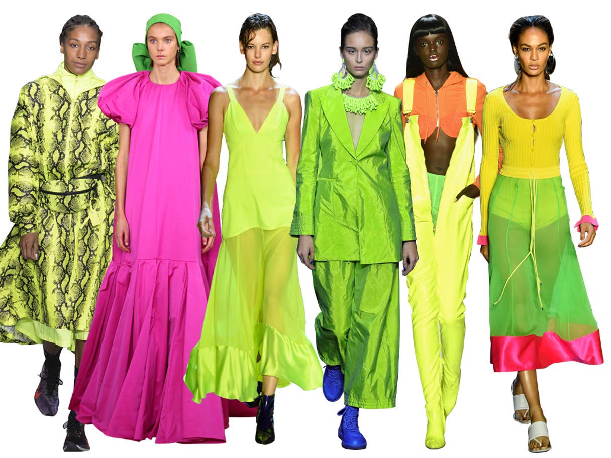
For those of us with warm skin tones who don’t look good in black, navy is an excellent alternative, but your LBD that isn’t black could be another neutral colour or even bright red.

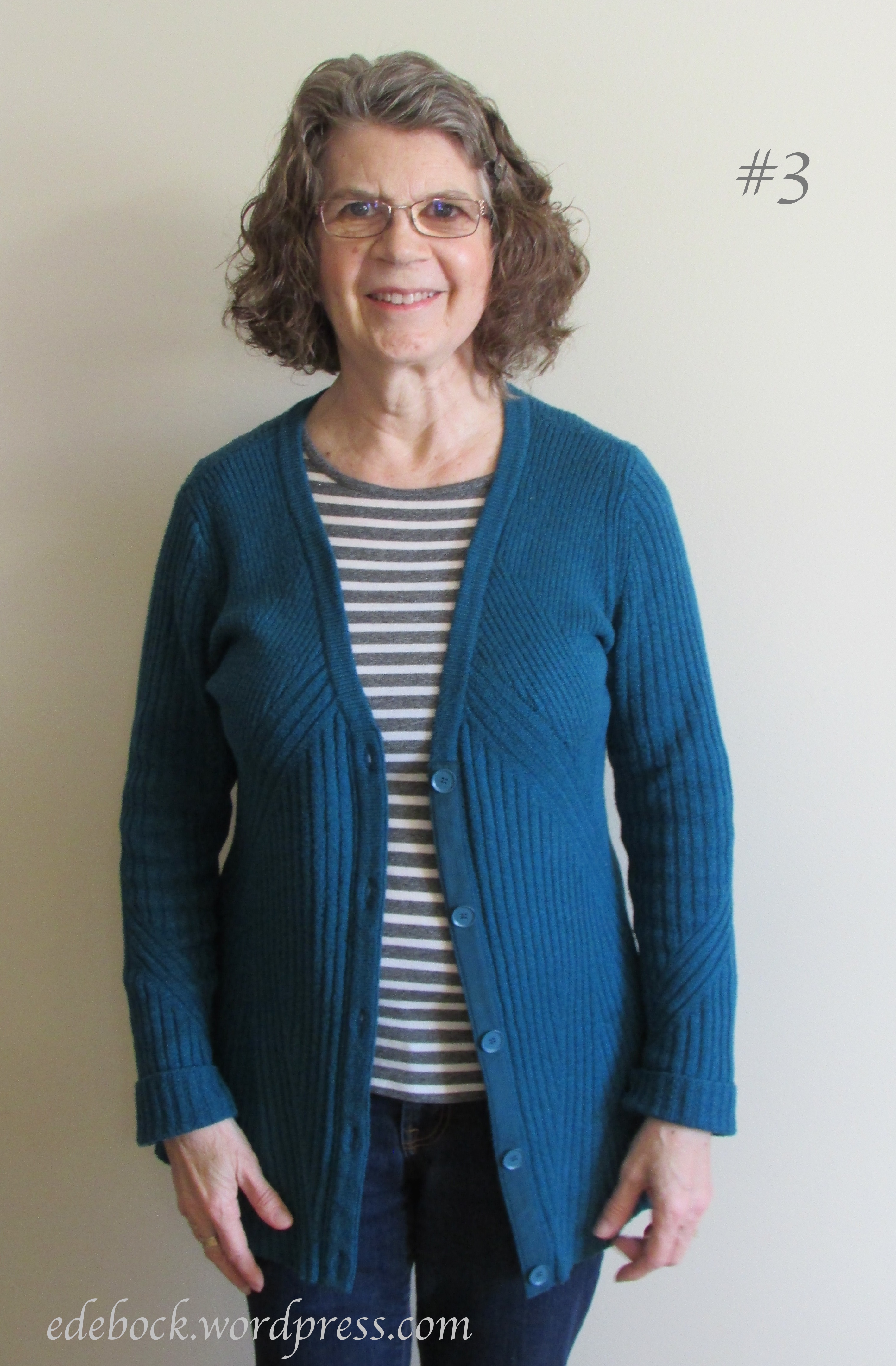
So, whether your LBD is black, navy blue, chocolate brown, charcoal, camel, or red, how do you choose the right one? First of all, make sure that the fit is perfect and choose a simple style that flatters your body shape. When you slip into it, you should feel glamorous. Length is optional. You can go as short as above the knee, choose a longer maxi style, or go for something in between. Avoid trendy hemlines as you want to wear it for many, many seasons.  Though the LBD is most often sleeveless, this is also a matter of choice. If you aren’t keen on your upper arms being seen, you can certainly opt for one with sleeves. If you travel a lot, choose a fabric that doesn’t come out of the suitcase looking like a wrinkled mess, ideally one that you can wash in a hotel sink and hang to dry.  

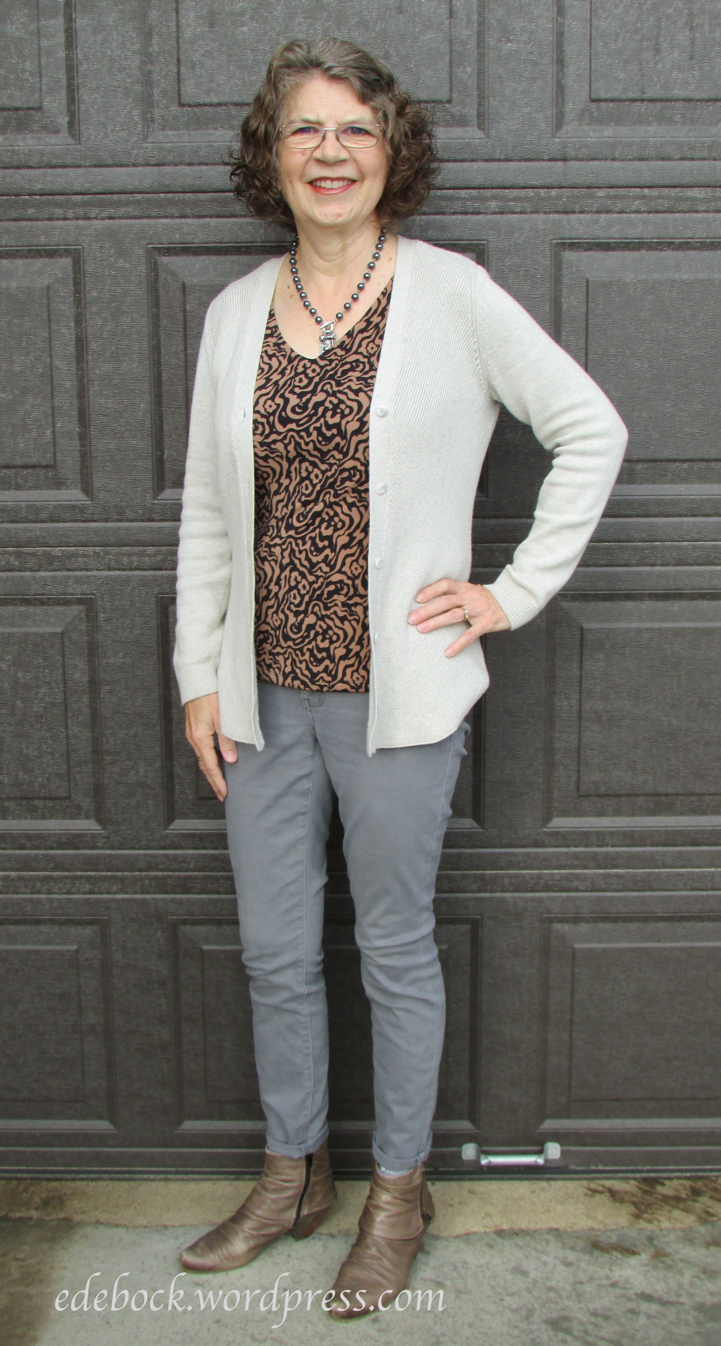
The power and versatility of the LBD of any colour is in the accessories. You can wear it with shiny jewelry and heels for a fancy party or pair it with ballet flats and a cardigan for a casual night out. Play around with scarves, wraps, necklaces, belts, and other accessories. Wear it with a blazer, a jean jacket, or a sparkly sweater. With one simple dress and the things you already have in your closet, you’ll create a multitude of different looks. 

So ladies, if you don’t already have a dress like this in your wardrobe, what are you waiting for? Just remember, it doesn’t have to be black!  

download (1)


Fashion trends for spring 2020

LogoIt’s still winter here on the Canadian prairie and will be for a couple more months, but when February rolls around I always begin to think about spring. Today, let’s take a look at 11 fashion trends for the season that lies ahead. I must be getting old as I’ve seen many of them come and go before. In fact, this season looks very much like a 1970s rerun!

1.  Crochet  

crochet-spring-2020-fashion-trends-look-style-details-tendencias-moda-godustyle

Definitely not your Grandma’s doilies, but crochet is being seen in dresses, suits, tops, and evening wear. Runway looks are usually a little over the top for most of us, but I have fond memories of a crocheted vest in my high school years and I could certainly see myself wearing something like this.

crochet-outfit-ideas-3

2.  Hot Pants  For those of you who weren’t around in the 70s and may not yet be familiar with the term, hot pants are teeny, tiny, ultra short shorts worn not as beach wear, but for much dressier occasions. Back in the day, I thought I was quite something in my black velveteen hot pants, but looking back I suspect that they weren’t particularly flattering with my toothpick legs. This is one trend I definitely won’t be revisiting!

3.  Neon Colours  You’ll never see me in head to toe fluorescents, but it would be easy to add a touch of this trend to your spring wardrobe by opting for a neon accessory. Perhaps a pair of sneakers, a purse, a scarf, or even a simple bracelet.

Neon

4.  Bras  We’re not talking under garments or exercise wear here, but bras worn under blazers or alone with high waisted pants and skirts. Again, not something I’ll be wearing!

5. Suits With Shorts  If I was still teaching instead of happily retired, I could definitely see myself investing in one of these menswear inspired suits with Bermuda shorts. It’s a nice take on business casual and if the trend doesn’t last, the pieces could still be worn separately.

6.  Vests  Here’s another masculine inspired trend. Vests are being worn as part of three piece suits, mismatched with a blazer, or alone. I’m kicking myself for getting rid of the ones I wore back in the 80s or 90s. If I still had them, I’d definitely wear them again.

7.  Psychedelic Prints  Think 1960s wallpaper!

8.  Leather  Once reserved for fall and winter, leather is having a moment this spring. Brightly coloured and buttery soft, leather is appearing as skirts, pants, jackets, and coats. I’ll definitely be getting out my leather jackets as soon as the weather warms up a bit.

leather-trend-outfit-1568311780

9.  Polka Dots  Big dots, little dots, colourful dots, dots on dresses, dots on pants, dots on shoes… polka dots are everywhere! This is a trend that’s been around for awhile and shows no signs of fading. It’s one that I haven’t fully embraced yet, but I actually like both these looks. It’s also a trend that’s easy to introduce in smaller amounts with polka dotted accessories.

10.  See-through Sheer  Chiffon and tulle create airy looks that no woman in her right mind is going to wear as shown on the runway, but I’m sure we’ll see this trend translated into looks that will be very wearable. I’m thinking of sheer sleeves and overlays.

11.  Trench Coats  Nothing says spring like a practical, dependable trench coat. This is another trend that isn’t going anywhere. This year we’re seeing classic beige as well as some lovely feminine colours.

Clearly mine is still in style and I look forward to wearing it again!

Will you be wearing any of these trends this spring? If so, which ones? Do tell!

Thrifting again

LogoCleaning out the storage room as well as trying to make more space on our bookshelves has resulted in me taking two loads to the local thrift store recently. Of course, I can’t just drop things off without taking a look around! As a result, for a total of just $7, I added three items to my wardrobe last week. Today, let’s take a look at why I chose each one.

Since finding my little packet of colour swatches, I’ve been looking at my closet with a critical eye and realizing that I need to work on returning to the colours that suit me best. That means no more black worn anywhere near my face unless I can add something, such as a scarf, in a colour that doesn’t wash me out. While I can wear a light dove grey, I’ve really overloaded the closet with greys of every shade and I need to steer away from that colour for awhile. Colour was definitely my main focus as I looked through the racks of second-hand clothing.

IMG_0728

Navy is a universal colour and for me, a much more flattering background for this blouse’s large floral design than black would be. Even the peachy and rust tones in the roses are part of my Spring palette.

The top ticked lots of other boxes as well. In spite of the fact that it’s a small and I usually wear medium, the fit is absolutely perfect. Even the sleeves are long enough which is often a problem for me. That’s one of my tips for second-hand shopping. Don’t limit your search to the size you usually wear. If something catches your eye and looks like a possibility, try it on. I love the shirttail hem that hangs longer at the back. Though I’m wearing it with jeans, it will also provide plenty of coverage with leggings. Lastly, this will be a great piece for travel. The lightweight polyester crepe won’t take up much space in a suitcase, is hand washable, dries very quickly, and doesn’t wrinkle.

IMG_0746

As I looked over my closet, I noticed a distinct lack of green. The greens shown in my little packet of swatches are a pale pastel, a brighter lime green, and a shade that I would probably call emerald. Muddier tones like moss and khaki green are more often included in a Fall palette, but some colour analysts also recommend them for people with my Spring complexion. Since Springs and Falls both have warm undertones to our skin, we can more easily get away with wearing colours from one another’s palettes.

IMG_0748

Cozy sweaters are an essential part of my winter wardrobe. This soft acrylic knit is lightweight and comfortable and provides just the right level of warmth at this time of year. The V neck is flattering and the attached mock cami makes getting dressed super simple. Though you can’t see it in the photo, the back of the neck is high adding to the cozy warm feeling on a chilly winter morning. Again, the fit is perfect; body skimming but not tight enough to show off any bulgy bits. Closer examination reveals that, though predominantly green, the knit is actually a mixture of many warm colours.

IMG_0760

I was at the counter ready to pay for my other purchases when this eternity scarf called my name from a nearby display.

IMG_0761

My photographer wasn’t home when I was finishing up this post, but you can easily see how I can use a scarf like this one to add colour close to my face when I wear a black sweater or top. The turquoise background is one of my Spring colours as are the shades in the repeating pattern which, on closer inspection, turned out to be an owl.

IMG_0764

Earlier this week, while doing some research on the most eco-friendly fabrics available, I read that wearing recycled clothing is the most sustainable way to dress, so if you’re concerned about the environment, why not join me and go thrift store shopping!

Look what I found!

IMG_0635

That’s right, it’s the little packet of colour swatches that I was searching for back in August! I practically turned the house inside out looking for it back then and ended up cleaning out all twelve drawers in my bedroom, but it was nowhere to be found. Then, this week, I started cleaning out the basement storage room, a job that badly needed to be done. I’d long given up any hope of finding the colour swatches, but there they were in the very first bin I opened! Interestingly, I was already planning to write about colour this week; the difference that colour can make.

First a little background. As I’ve mentioned before, it all begins with skin tone. Knowing whether your skin has cool or warm undertones can help in choosing the colours that are best for you. When I had my colours ‘done’ back in the 1980s, I learned that my skin has warm undertones and I was given the little packet of fabric swatches in the colours that were deemed to be most flattering for me. While sticking to a specific palette might seem too restrictive, knowing which colours make you come alive and which, especially when they’re worn close to your face, make you look tired or washed out can definitely help you look your best.

Let me show you what I mean. For the purposes of this exercise, I’ve kept everything the same except the cardigans; same plain background, same lighting, same makeup, same wild and crazy hair, same grey striped Breton top and dark wash jeans. (I’m thinking that my high school science teachers would be proud of me!)

Let’s take a closer look.

IMG_0690#
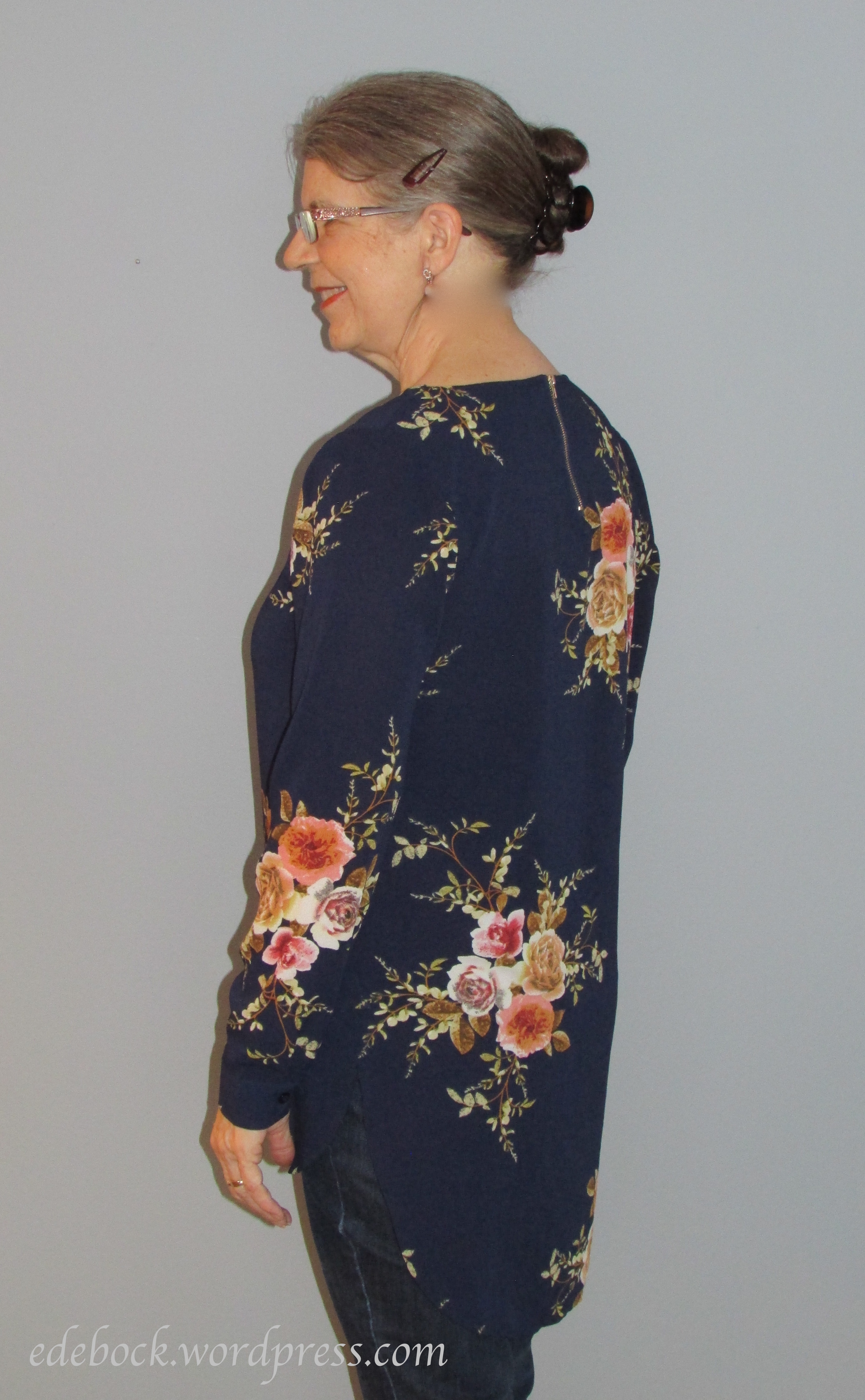
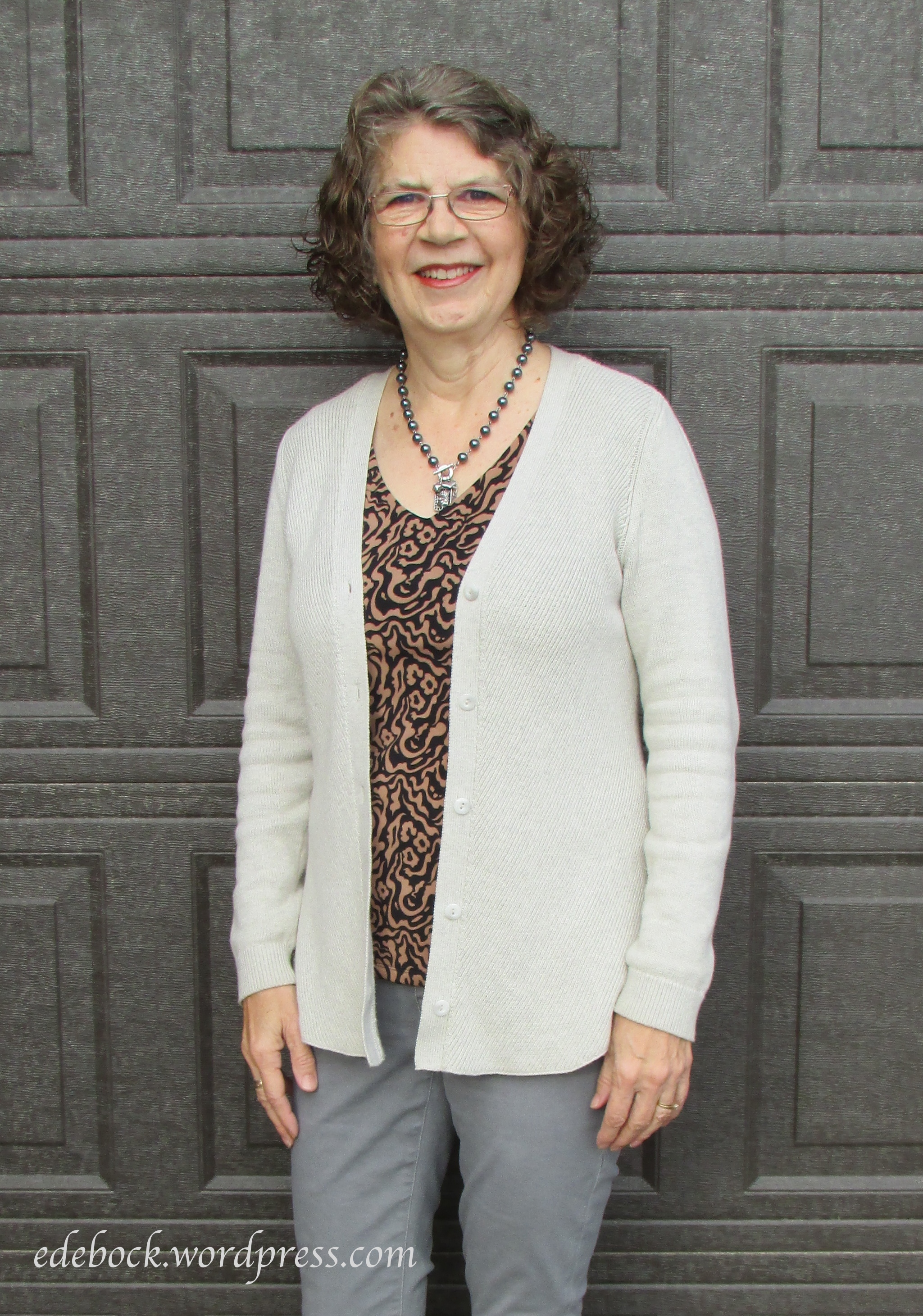
1:  Black is not a great choice for someone with my complexion. It drains me of colour making me look pale and haggard. The grey panels on the shoulders  and in the top help, but this is still not a particularly good look for me. I could improve it somewhat by intensifying my makeup or wearing a brighter top under the sweater.

IMG_0688

#2:  Oatmeal, or vanilla as my swatches call it, is one of my recommended colours. It looks a little drab against the plain wall, but it’s less harsh than black and looks better on me. Can you see the difference?

IMG_0693

#3:  I promise that I didn’t add any makeup before this picture was taken, but look at the difference in my face! Teal is a universal colour that suits everyone. Long before I had my colours ‘done’ I knew that it looked good on me. You probably can’t tell in the photo, but it even makes my grey eyes look blue!

If you aren’t sure whether your skin has warm or cool undertones, one easy way to figure this out is to look at the veins on the inside of your wrist. Do they look blue or green? If they appear more blue, you are cool-toned; if they’re more green, you’re warm-toned. The study of colour can be a complex one, but essentially, if you are cool-toned, take your inspiration from the cool end of the spectrum. Bright blues, deep purples, emerald greens, and frosty shades of lavender, ice blue, and pink will look good on you. If you’re warm-toned, look to the warm end of the spectrum for your best colours. Think fiery reds, peach, coral, oranges and rusty tones, creams, camel, and earth tones.

According to the experts, we can all wear virtually any colour – it’s simply a matter of figuring out which shades suit us best. For example, everyone can wear red, but it’s a matter of knowing which shade is most complementary to your complexion. Those, like myself, with warm skin tones should choose orange-tinted reds, while those with cool skin tones look better wearing blue-based reds.

Now that I’ve finally found my swatches, will I stick only to wearing those colours? Probably not, but I am going to go through my closet and take a look at how far I’ve strayed from the colours that are my best. I know that I’ve instinctively made a lot of good choices, but also some, like the black sweater, that are not so good. I’m definitely not planning on doing an entire wardrobe overhaul, but I do intend to do a better job of taking what I know about colour into consideration when I’m making decisions about which items to keep long term and what to buy in the future.

Now I need to get back to cleaning that storage room. Who knows what else I might find!

Logo

Inspiration everywhere

LogoEarlier this week, image consultant and fashion blogger, Brenda Kinsel, offered readers of her Tips & Teasers Facebook page this challenge:

“See all the colors in the background of this pic? Using any colors in this palette create an imaginary outfit – pants, top, jacket, jewels, etc. Tell us what it looks like!”

77053039_2451793418266594_1912915452237971456_n

Rather than creating an imaginary outfit, I shopped my closet and this is what I came up with.

IMG_0411

It’s a casual look built entirely of neutrals, but I think the pattern in the top lifts it out of drab. The grey skinny jeans, oatmeal cardigan, and black pearl necklace are all cabi from previous seasons. The taupe ankle boots are also several years old. Only the sleeveless V-neck top from Cleo, one of my favourite Canadian brands, is new.

Who would have thought that anyone could take fashion inspiration from a rusty old wall of corrugated metal? Brenda, that’s who! I absolutely love her blog and have learned so much from her. She seems to find inspiration everywhere!

IMG_0409 2.jpg

Thank you, Brenda! Obviously I need to start looking at old walls and other random things with a new eye!


The art of getting dressed

LogoBefore we look at how we dress, let’s consider why we clothe our bodies. First of all, not to would be considered immodest and in most cases illegal! Of course, we also dress to protect our bodies from cold and from the damaging rays of the sun. If those were our only reasons for wearing clothing though, we could all dress the same and we’d only need two outfits each, one to wear and one to launder. We’d need very little closet space, it would be so much easier on the environment, and just think of how much money we’d save! It would also be incredibly BORING!

Clearly, our clothes serve another purpose. They are an expression of who we are, of our individual uniqueness. That’s why I encourage you to identify your personal style if you haven’t already done so.

433d67c8a179d2f32e67c87f8df403b4

It’s also important to dress the body you have, not the one you want or the one you used to have. Like most fashion bloggers, I don’t show you how I dress in hopes that you’ll copy me. Absolutely not! My goal is to encourage and inspire you to experiment with fashion and to learn how to dress in a way that fits your personality and makes you happy. I love the comment that one reader left on another blog recently. She said, “You wear you and I’ll wear me!”

Getting dressed is like creating a work of art. Every morning, you start with a blank canvas. Many artists begin a painting with the background. We, too, need a good foundation to build our work of art on. That means wearing good quality undergarments that fit well and keep everything in place.

Next we begin to fill our painting with the larger shapes. As you look into your closet and choose which pieces to use to build your outfit, consider where you’ll be going, what you’ll be doing, and what you want your look to say about you. Once you’ve established that, use accessories and makeup to add finishing touches to your work of art.

Artists also experiment with colour. While having your colours “done” and sticking to a specific palette (no, I haven’t found my swatches!) may seem too restrictive, it does help to know which colours make you come alive and which, especially when they’re worn close to your face, make you look tired or washed out. Knowing whether your skin has cool or warm undertones can help in choosing the colours that are best for you. One easy way to figure this out is to look at the veins on the inside of your wrist. Do they look blue or green? If they appear more blue, you are cool-toned; if they’re more green, you’re warm toned. The study of colour can be a complex one, but essentially, if you are cool-toned, take your inspiration from the cool end of the spectrum. Bright blues, deep purples, emerald greens, and frosty shades of lavender, ice blue, and pink will look good on you. If you’re warm-toned, look to the warm end of the spectrum for your best colours. Think fiery reds, peach, coral, oranges and rusty tones, creams, camel, and earth tones. Of course, there are also those universal colours that look good on everyone. In addition to experimenting with colour, you might enjoy mixing patterns as well.

Now, at the start of each day, whether you’re going somewhere special or just staying home, take a look in your closet and create a fabulous work of art! You are so worth it!


Universal colours

LogoI’ve been turning the house inside out lately looking for something. Has that ever happened to you?

Back in the 1980s, when I had my colours “done”, I received a little packet of fabric swatches in the Spring colours that were deemed to be most flattering for someone with my skin tone and colouring. For several years, I carried it in my purse and used it as a guide when I shopped. In time, however, I started colouring outside the lines, so to speak. I found myself using my swatches less and experimenting more with other colours. Eventually, I put the little packet of fabric pieces away in a drawer in my bedroom, or at least that’s what I thought I did!

In recent months I’ve noticed a resurgence of interest in knowing your colours and dressing accordingly amongst some of the fashion bloggers that I read regularly. That led me to wonder how far I’ve strayed from my own colour palette, so I went to the dresser drawer to retrieve my swatches. The only problem was, they weren’t there! That’s when the search began. I’d estimate that the little packet is about 10 cm x 6 cm x 1.5 cm thick. There are a LOT of places in this house where something that small could be hiding!

Since I haven’t found it yet, perhaps this is a good time for me to think about universal colours. Six weeks ago, I wrote about neutrals, those colours that go well with all the other colours in the closet. Universal colours, however, are the ones that look good on just about everyone. If you don’t know what season you are, what colours look best on you, you really can’t go wrong with universals. They flatter all skin tones.

There are six colours that are most often listed as universals:

xUniveralcolors400.jpg.pagespeed.ic.R-J9_jsNLd

Soft white and stone, a medium to light grey, also appear on many lists. I’ve sometimes seen red referred to as a universal colour, but I would disagree because though there is a red for everyone, not every red looks good on every person. Those, like myself, with warm skin tones should choose orange tinted reds, while those with cool skin tones look better wearing blue-based reds. Not sure which one is right for you? Click here.

Universal colours are frequently chosen for staff uniforms because they look good on everyone. If you’re planning a wedding and want to keep a bevy of beautiful bridesmaids happy and looking their best, selecting a universal colour for their dresses is also a sensible choice.

Now, back to searching for that little packet of fabric swatches. Wish me luck!

Building a cohesive wardrobe

LogoI’ve written before about my 3Cs of fashion… classy, confident, and comfortable, but today I want to look at another C… cohesive. Cohesion could be the difference between a wardrobe that works and one that doesn’t, so what does this C word mean?

According to the Cambridge Dictionary, cohesive means “united and working together effectively” and the Collins English Dictionary says that something that is cohesive “consists of parts that fit together well and form a united whole”. That sounds like a workable wardrobe to me!

So what makes a wardrobe cohesive? I would suggest two things… most of the tops work with most of the bottoms and the majority of the garments are versatile enough to be dressed up or down for a variety of venues and occasions.

How then do we build that cohesive wardrobe? Obviously, few of us can scrap our entire closet full of clothes and start from scratch, but begin by evaluating what you already have and then work toward making purchases that add cohesion.

  • If you haven’t already, define your personal style. I’ve written about how to use Pinterest to help you do that here.
  • Choose a colour palette. Build your basic wardrobe around a few colours that suit your complexion, that you feel drawn to, and that coordinate well with one another. This doesn’t have to be boring. Scarves and accessories are a great way to add pops of other colours. Pattern and texture also add variety.
  • Only buy pieces that will go with what you already own. Ask yourself, can I wear this at least three different ways with items that I already have in my closet? If so, it will probably be a good purchase. This may not work for something like a special occasion dress, but it’s a good rule of thumb for most other wardrobe purchases.

If you follow these simple suggestions, you’ll end up with a cohesive wardrobe that will make getting dressed in the morning easy and enjoyable. No more staring at a closet full of mismatched clothes and moaning about having nothing to wear!

Nothing to wear

image

I’ve been thinking a lot about cohesiveness lately for two reasons. First of all, spring is finally coming to the Canadian prairie and I’ll soon be doing my seasonal wardrobe switch. As I bring out my spring/summer wardrobe, I’ll be looking at it with a critical eye and deciding where the gaps are and what I need to fill them with. Secondly, it’s less than two weeks until I’ll be packing that teeny tiny suitcase and flying off to Europe for three and a half weeks. This will be our first attempt at traveling with carry-on luggage only, so whatever goes into that one little suitcase is going to have to work well together!

Colour trends for Spring 2019

LogoRegardless of whether or not the groundhog sees his shadow on February 2nd, when the calendar turns to February, I begin to think about spring. There’s probably plenty of winter left where I live, but as I revelled in the vibrant colours of Coatepec, Mexico over the past couple of weeks, my mind went to the colours that are going to be popular in spring and summer fashions this year.

If you bought into the yellow trend in 2018, you’ll be pleased to know that it’s still very much on the fashion agenda for this year. It showed up on the runways in many shades from the palest pastel to bright lemony and deep yellows.

Pastels in other hues including soft pinks, lilac, light green, and pale blue were also seen.

Intense, saturated colours including bright orange, coral, magenta, bright reds, mango,  neon green, and royal blue dominated the runways though. If yellow isn’t your colour, you may want to add some of these to your spring and summer wardrobe.

While one of my fashion goals for 2019 is to steer away from the greys that have dominated my wardrobe in recent times and bring in some more colour, I’m in love with this season’s neutrals. Amongst them are buttery off-whites, creamy tans, and beiges.

Brown continues to make a comeback in beautiful toffee hues as well as darker shades.

Two of my favourites neutrals of the season are moss green and a very dark navy that’s being called Eclipse.

As always, before you go out and buy a new wardrobe filled with this season’s colours, shop your own closet. What do you already have that will carry over from previous years? Also, be careful to choose the shades that look best with your natural colouring.

The colours of Coatepec

The last time we came to Coatepec, Mexico to visit our friends, Richard M and Colleen, I fell in love with the Spanish colonial architecture. On that visit, I wrote a post about the amazing doors and windows, but another thing that stood out to me was the vibrant colours!

img_3579
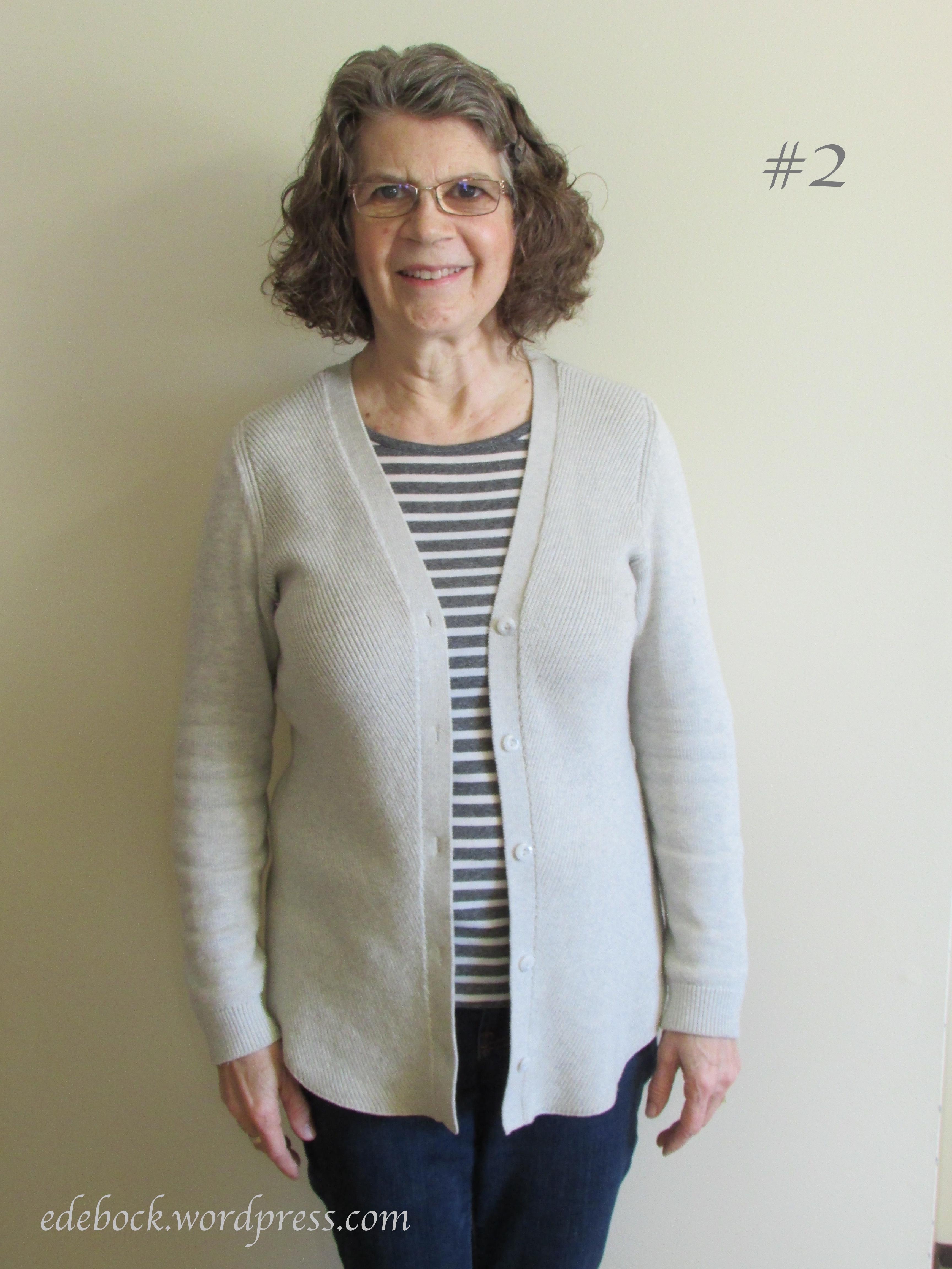
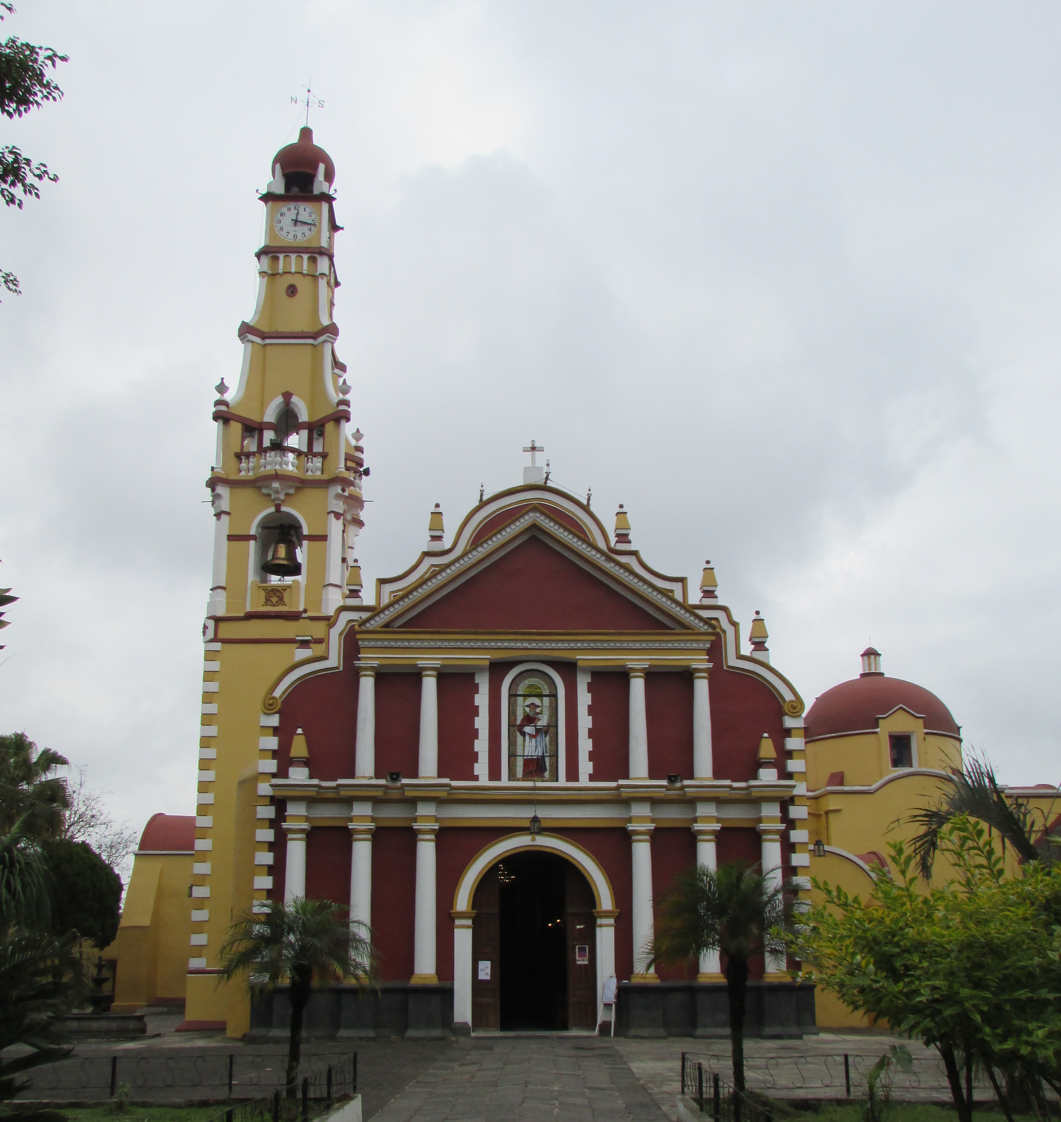
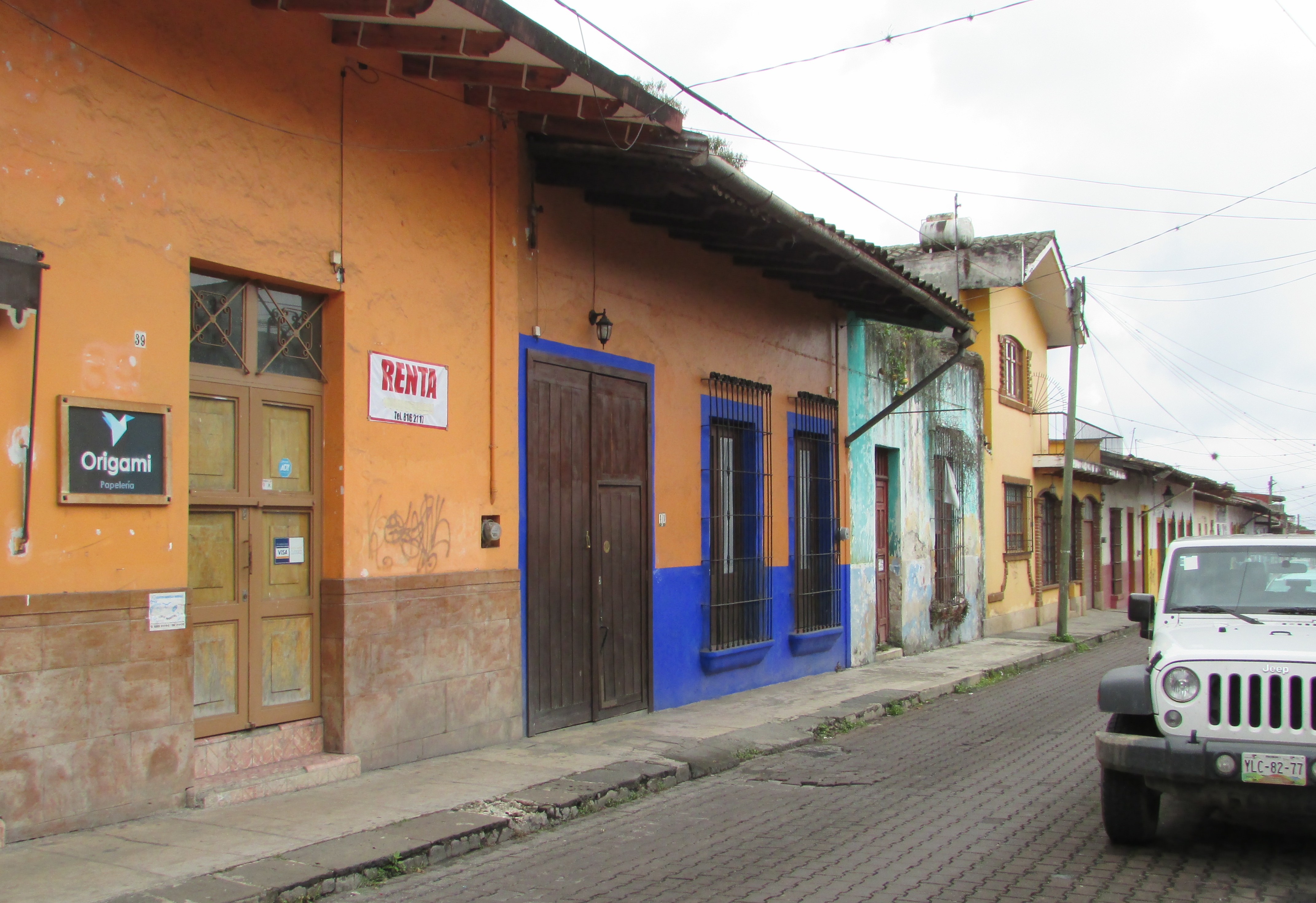
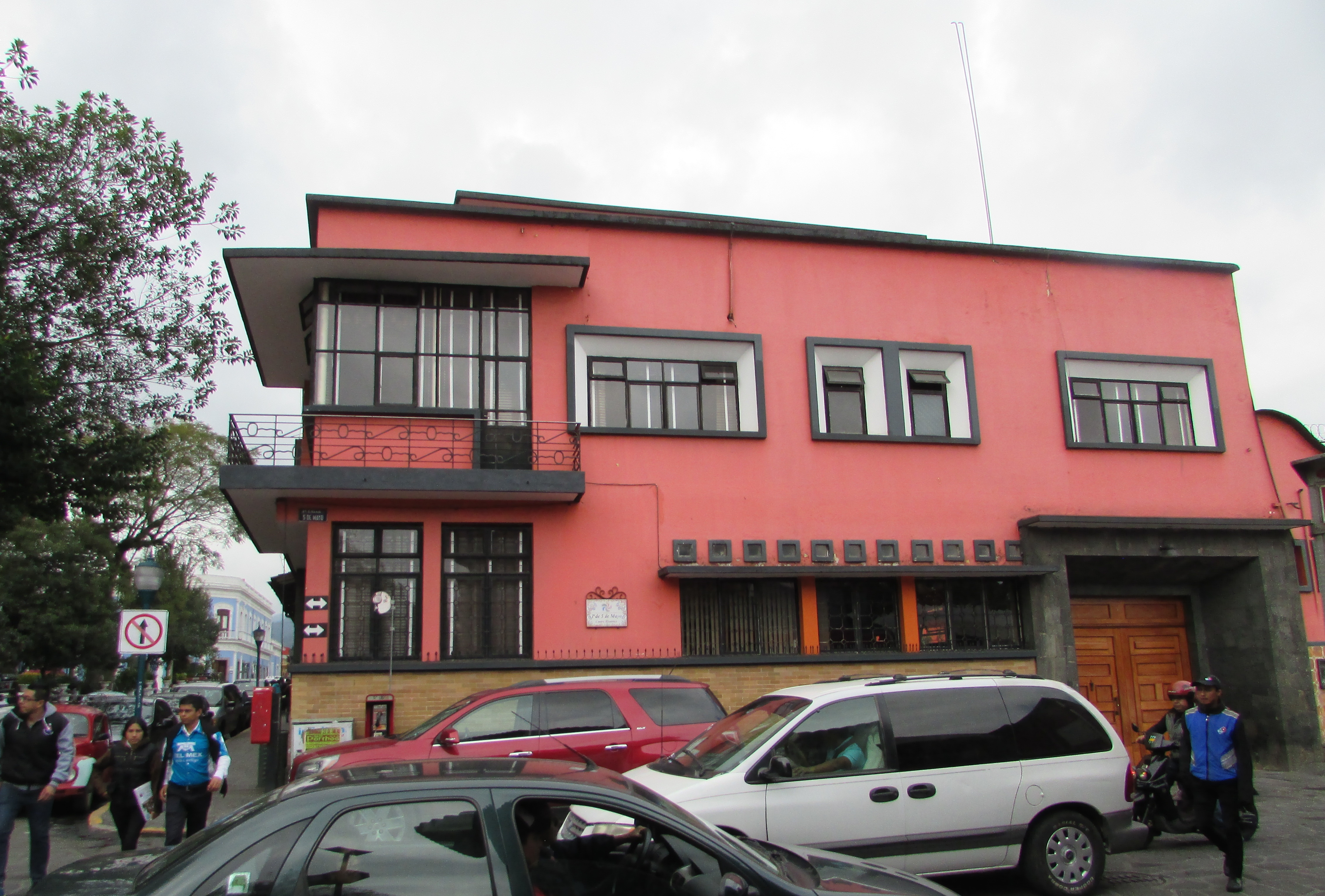
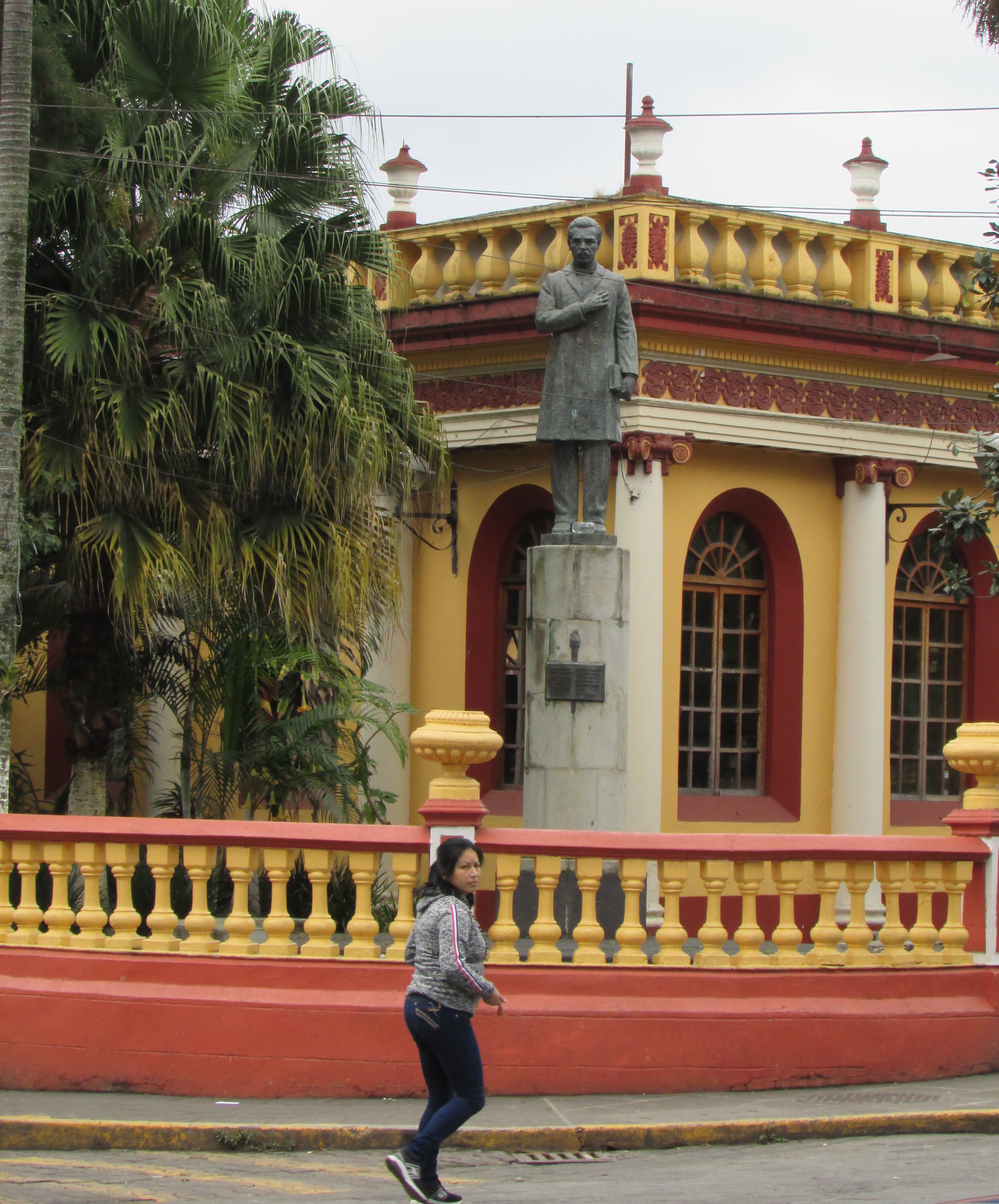
Living in Alberta, we spend the long winter months in a mostly monochromatic world. With the trees bare and the ground covered with snow, we live in shades of black, grey, and white. Perhaps that’s why I’m so drawn to this colourful culture. Today, we spent several hours walking around the central part of town.

Just off one side of Miguel Hidalgo Park is the beautiful San Jerónimo Church.

img_6817

Homes and businesses are equally as colourful. Come walk with me.

img_6833

img_6835

img_6842

img_6848

img_6850

img_6847

img_6852

img_6855

It’s been cloudy and fairly cool since we arrived, but the colours of Coatepec are definitely a welcome respite from our Canadian winter!